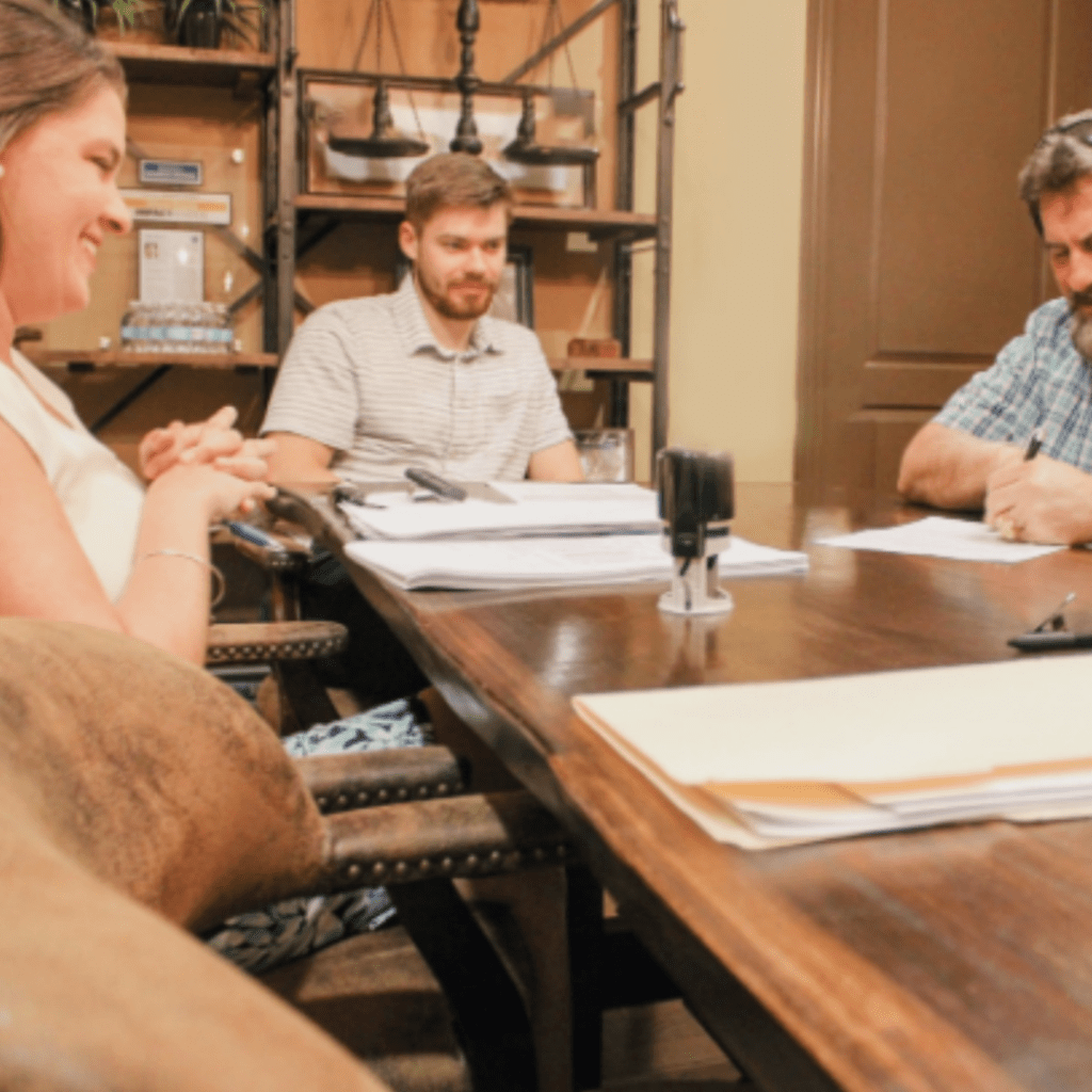
In case you haven’t heard, we launched a new website! The project began last fall, and we are so excited to be able to share it with you. Read why a new website became a top priority and the decisions that led us to design a more client-centric web experience.
Why redesign our website
Redesigning our website was the last thing on Todd Tressler’s mind when he invited Megan Climer to join the Tressler leadership team back in August. The team had recently launched a new website with a modern and bold design.
Just a few weeks into her new role, Megan led the team through a series of brand development sessions. It was during these sessions we began to see the disconnect in our brand message and visual identity. Together we worked to develop a clear brand identity and unique ways to share our brand story.
After we settled on our brand vision, mission values and essence, Megan dove into web design and user experience (UX) resources to develop a concept to present to the team. We all agreed a rebrand was necessary, and our website would be a top priority.
A new web experience
With our brand clearly defined, it was easier to identify what changes needed to be made to offer a web experience that felt warm, inviting and helpful. Our goal was to share our brand story and deliver a more approachable legal experience to our clients and the community.
Approachable
As we defined the essence and personality of our brand, approachable was an attribute that rose to the top. From our warm color palette and personal photos, to the site’s tonal narrative and logo, approachability is experienced throughout the site. It was important our new website to foster connection and build trust with our audience.
Simplicity
Our new website is simple in both structure and design. The site’s navigation logic sets clear expectations and predictable paths. With each click, a user can easily anticipate what comes next. No one likes to work hard when they are exploring a website. We wanted our content experience to be natural and intuitive. You can learn about us without sifting through overwhelming amounts of legalese and extra talk.
Add value
After carefully auditing the content of our previous website, we were able to downsize our website from 90 pages to 26. The information we removed will have new purpose as informative blogs, podcasts, videos, and downloadables. These resources can be found in our new ‘Resources’ library which will continue to grow and hopefully add value to our clients and community.
Transparency
One of the barriers we face as a law firm is most people are afraid to contact us because they assume the costs are too high, the services are too hard to understand, and the attorneys are too out of touch. This may be true for some law firms, but not for us. We know most lawfirms do not openly publish pricing, but we’re not like most lawfirms. We share our prices because we believe we all make better decisions when we are fully informed. We want our clients to feel confident when making a decision. We aim to earn their trust, and keep it.
Tell our brand story
Our new website invites users to learn more about us, our history, our team and our culture. Through these pages you can learn who we are as individuals, who we are as a team, and what you can expect when you choose to work with us.
What’s next from the Tressler brand
We’re incredibly excited about our new brand and web experience. With our brand aligned and our brand experience focused on you, we hope you find the answers and support you need with our team. You are the reason we do what we do, and we are grateful for your support, encouragement, friendship and trust. You can explore our new website at https://tresslerassociates.com.


